Types and Faces
My friend Nate pointed out André Gide's Travels in the Congo to me a few months ago. We've been carrying on this occasional conversation about travel writing, perceptions, Africa, Conrad and the like.

In passing he mentioned that the book's typeface reminded him of Rob Giampietro's fascinating article on the Neuland question which discusses
"Neuland, a "display" typeface hand-carved in 1923 by Rudolf Koch but also Lithos, another "display" typeface digitally created in 1989 by Carol Twombly"...Let's have Nadine Gordimer as the token African.
How did these two typefaces come to signify Africans and African-Americans, regardless of how a designer uses them, and regardless of the purpose for which their creators originally intended them?

Richard Wright can serve as the token African-American.

There's a discussion about the history of those typefaces and how they came to embody an authentic sense of, well, ethnicity shall we say. "Stereotypography" was how Nate put it. "Blackface" might be another appropriate pun. There's lots to say about such signifiers. I can certainly imagine further papers on "Issues of authenticity and its visual vocabulary: field lessons from Gutenberg's press".
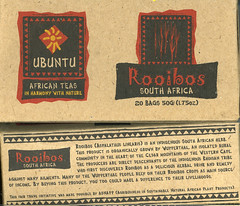
All of which reminded me of the box of Ubuntu Rooibos tea from South Africa that The Wife had picked up on her travels. It's one of those "sustainable agribusiness", fair trade, touchy-feely things marketed by an offshoot of USAID. The brand names, Ubuntu and Mpuntu, let you know what you're getting into. In case you're not convinced, the obligatory typeface is a great signifier and adds the requisite marketing frisson of authenticity: Africa. Motherland. Earth etc.
My own copy of the Travels in the Congo arrived in the mail today, and before I could turn the page and note Gide's dedication to Joseph Conrad (all travel writing owes a debt to Conrad so this was unsurprising), I was confronted by the striking cover. I realized that I'd ordered a different edition.
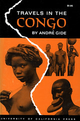
Hmmm. That's more like it. Congo: breasts, nudity, enlarged ornamental lips, pygmies, natives. You don't tend to see these kinds of images on book covers any longer. They'll appear on National Geographic magazines to be sure, or coffee table books, but not on the paperback that you pull out on the bus. It appears that some cultural threshold has been crossed in the recent past, my guess is that this took place around the mid-seventies and there has been a consequent marketing realignment or adjustment.
A more subtle indicator is required and the typeface is one of the few tools product designers have, along with the product names to indicate the essence of the product they are trying to move. You need to know what you're getting but these days we don't discuss race - or at least it's always a very polite discussion. As we say in Ghana: how for do?
A theory formed in my mind that when it came time to revise Gide's work in the later 1994 edition, it was no longer culturally appropriate in the US to display nubile, big-lipped natives, even if they were all the rage back when my 1962 edition was published (that liberal Berkeley Press!). There are probably throngs of academics working on such material.
I amended the topic of the paper to "Changing mores, changing types, changing faces in representations of Africa: field lessons from Gutenberg's press". I like how academic papers seem to go with lots of sub-clauses in their paper titles.
I then remembered that Fred had discussed Then I Saw the Congo, a 1920's travel memoir by Grace Flandrau. I put in my order for that book; we all need more writing about Congo. Its cover is less exotic than Gide's. Its subtle imagery, the silhouetted rowboat of natives on the Congo river dates back to Stanley's expeditions. The mighty river Congo has great visual appeal and looms large in African iconography.
I turned around, glanced at my bookshelf and immediately noticed a couple of books that fit the visual mold. The first was In Griot Time, An American guitarist in Mali by Banning Eyre. The ubiquitous font is overlaid on his photo of Djelimady Tounkara who Teju Cole reckons as the best guitarist in the world - I won't quibble, but what about Prince?

Checking Amazon, I noticed that a later edition (2002 - only 2 years on) dispenses with our typeface-du-jour and sadly also that the musician, whose face I can no longer make out, is now squashed behind the prison bar-like guitar strings tucked in the cavernous confines of a grey guitar.

What should one make of the demotion of both the black-faced guitarist and our typeface? What was the designer attempting in the reworked cover? In mitigation, one notes that there is the green, yellow and red in the background to indicate the colours of the Malian flag, although one must add, the colours are washed out, perhaps to indicate the ancient status of the music, and of Mali. Authenticity is preserved, I suppose, although the ethnic signifiers have been toned down. I guess it's fair, there was no need to beat the shopper over the head as the original cover did. We could have figured things out from the subtitle.
Robert Klitgaard's Tropical Gangsters also jumped out to me.

It has the great subtitle: "One man's experience with development and decadence in deepest Africa". You don't quite need to write "darkness", "deepest Africa" gets the point across. Now of course Condi Rice and co. have no qualms dealing with the Equatorial Gangsters that Klitgaard deconstructs in his book, so I guess decadence is appropriate in the title. Kurtz's moral decay is quite apt when one reads things like the following hatchet job (Thatcher alert):
Equatorial Guinea had the bad luck to come to independence under Macias Nguema, whose rule was so terrible that a third of the population was either killed or fled. Though he had people garrotted, buried alive and beheaded (and their heads stuck on poles), the detail that sticks in my mind is his having 150 people executed to the tune of 'Those Were the Days, My Friend' played over stadium loudspeakers.Tropical horrors continue to be our mainstay on the continent it is sad to say. Everyone owes a debt of gratitude to Conrad it seems.
Which reminds me... The best history book on Africa since independence is Paul Nugent's appropriately titled Africa Since Independence.

If you take a look at the cover, it's as if you are out on a safari, the zebra is quietly crossing the scene in the foreground, the wide trees spread out in vistas of the savanna, you almost expect to spot a lion lazily stepping into to the picture - or an antelope perhaps. Simba. Kimba. Bambi etc. That image has almost nothing to do with the content of this brilliantly-constructed book other than to be a prime stereotype of Africa. Indeed I can't think of an image that could do more violence to the words of this sophisticated book, focused as it is on Africa's post-colonial history and the vagaries of modernity. Is that really the image of Africa since independence?
I'm fairly sure that Nugent had almost no input on his book's cover. Like almost all authors - and certainly all the ones I've pointed out in this note, let alone those South African rooibos farmers - he would have had nothing to do with the packaging of his works. Very few authors have the clout to insist on cover art, they are spent by the time the discussion over the book title is done. Still I almost disregarded his book, judging it as I did by its cover. Perhaps those purchasing history textbooks respond to different things. It goes to show that those cues can have can great influence, whether it is overt imagery or even typefaces.
I amended the paper's title: "Types and Faces: Visual Identites and cross-cultural (mis)understandings - (re)visting the Congo through fonts".
I would normally close with a playlist - and I've had requests for a Heart of Darkness playlist, but that can wait. Instead, apropos the business of not judging a book by its cover, I'll end with a Congolese proverb:
A white tooth has a bloody root.
File under: typeface, design, culture, aesthetic, stereotypes, Africa, black, typography, graphic, history, publishing, USA, African-American, Congo, literature, race, identity, observation, perception, Gide, toli

8 comments:
Wow....A white tooth has a bloody root....thx brother....
This is all very interesting... but I keep wondering, what typeface and cover would please you? For Nugent's book, for instance? Are there any examples that you definitely like?
Loaded questions... Let's take a pass at walking through them.
I quite like the Neuland and Lithos fonts - aesthetically and otherwise. Also they do their job so effectively that most don't notice what are now obvious signposts. In pointing out what was beneath the surface I was simply being curious not criticizing.
Similarly I'm not against showing loinclothes, pygmies and the like. That has been an integral aspect of some parts of Africa and obviously André Gide saw those things in his travels. I like the notion of what you see is what you get. To answer: I like all the covers except the Nugent book.
On the question of design, a couple of anecdotes:
At the grocery store the other day I was looking for some pita bread and picked up the brand whose package had lettering that looked vaguely Arabic. It was only when I looked more closely at the label that I noticed that this was something out of Illinois. I guess I was looking for something Lebanese or similar - authenticity in other words, in the split second when I cast my eyes across the aisle. Indeed the Lebanese brand did have Arabic lettering (less prominent than our mid-western version) - I wish I could decipher the differences between the two. Just for kicks I tried out the American version and it seemed fine to my admittedly uncouth palate.
Over Christmas, I watched a cousin trying to put together a commemorative book for the Ghana at 50 celebrations and her design process. Her initial tools: a touch of kente, a few Adinkra symbols, the customary red, gold, green and the black star of our flag and a stool. Those designs worked for me, they conveyed the essence of the book succinctly. She wasn't entirely happy however and eventually settled on more subtle design.
I would hazard that the cover of Nugent's book could stand in for the world's perceptions of Africa in any era, whether before or after independence.
My favourite saying is that there are 3 centuries of history taking place simultaneously in Africa and in most of the developing world. What is interesting is the emphasis that seems to be most popular: the traditional, the almost nativist and, on occasion, the infantile (think Lost Boys, helpless kids etc). There isn't much focus on the more modern aspects.
It begs the question of course: what a cover is meant to do? If it is simply to illustrates the content then on Nugent in particular it is entirely misleading, for the story of Africa since independence that he tells is of complex struggle to bring modernity the continent. I'd be more happy seeing say a panoramic view of Lagos embodying the messiness of the post-colonial story. I'd be happier, even if its a little cynical, to have covers reflect military rule, personality cults (say a rally at the height of Mobutu's reign), civil wars, famines even etc. The savanna is mentioned hardly in the book, unless in passing about how some economies rely on tourism, and possibly in environmental issues.
On the other hand, if the cover is simply to signal that this is Africa-related, then I guess it does a fine job.
In any case, the attractive, mostly scantily-clad women who proliferate in beer commercials, car advertisements and the like, signal the supposed potency of the product they move, and have little to do with the products themselves. That is fair, attractiveness or exoticism is a signifier and it works.
Lastly, and I don't know why I'm going on at such length, I've been monitoring Flickr periodically to get a sense of the visual Zeitgeist concerning Africa - perhaps worth writing about the evolution at some point. Looking at the current top 200 most 'interesting' photos tagged Africa you won't see much modernity. There were 65 photos of wild animals - the largest category, about 50 were landscapes (savanna or desert, pastoral scenes of the African south), the rest were mostly kids (we all love photos of kids), ceremonies and initiation rites (with the obligatory bare breasts etc). There were a couple of disturbing ones (skulls marking sites of Rwandan genocide), a Sierra Leonean amputee)...
I'm not being very scientific I know, but back in 2004 it was almost all wildlife and landscapes possibly 90%, holiday pics I guess. I'll handwave that there has been an evolution but I'll leave analysis to others.
It is all very interesting.
Nate adds further twists to the tale:
Rooibos tea ... I love how it's being (re)Africanized, despite the initial name -- the first Dutch settlers in S. Africa had a shakeresque austerity when it came to naming the flora: rooibos = "red bush"; grootboom = "big tree".
The first rooibos packaging I saw, brought back by a roommate during college, had a sort of dowdy victorian design, but very british. A few years later a S. African guy gave me some Lipton rooibos, in the standard multinational quasi-American packaging. The box from your scan reminds me of a lot of the designs (batiks especially) I saw in Zimbabwe, where, at the time, there seemed to be a good synergy between "artsy" white entrepreneurs and skilled local artisans, in producing beautiful objects that were also appealing to more westernized decorative sensibilities.
Here is a post at BoingBoing that uses an image that gave me a chuckle. The moment I saw it, I thought to myself that I had to share.
Great article, totally agree, as authors in general and particularly authors of African descent, the subtle (or unsubtle) syntax that is used to depict who and what we are to a 'wider' audience can be worrying, or just plain curious. A pet bug bear for me was the cover of Patrick Neate's Msungu Jim and the Great Chief Tuloko, which I ranted about for years... Check it out...
http://www.amazon.co.uk/Musungu-Jim-Great-Chief-Tuloko/dp/0140286551/ref=sr_1_4?ie=UTF8&s=books&qid=1222688125&sr=8-4
Thanks for writing this.
Apparently Paul Nugent managed to get the cover he deserved for the second edition of his book.
Post a Comment