Showing posts with label publishing. Show all posts

Tuesday, April 20, 2021

The Book Is Done

The book is done.

The book is done. As conceived, you've written what you wanted. No more fiddling.

The book is done. God knows, you thought this time would never come, it's a good feeling.

The book is done. You remember that you've said the same thing four times previously, that you've felt the same way with this one, felt the same confidence that you have a new creation.

The book is done. Of the pleasures of taking up one's pen, much has been written, but what about that other moment that you've just reached: the act of completion?

The book is done. You try to recall the original conception, but it's lost to you by this point. The muse wills what she wants, it was she that mandated the direction.

The book is done. Be it resolved, you'll ignore your inner editor, ignore those other gatekeepers, those interlopers on the journey to publication.

The book is done. For this moment at least, forget imposter syndrome and all those other inhibitions.

The book is done. Any typos and implausible scenarios are beside the point. Let's call them intentional misdirections, music to your fiction.

The book is done. Enough already, 45 poems and folktales should be enough, resist the temptation.

The book is done. You're the son of an editor, so you're always wary when someone presents what they believe is the finished article. "I'm done, here it is", they might say proudly and expectantly, and for good reason.

The book is done. You smile sympathetically but immediately start to consider how to break it to them that, yes, there has been an act of creation, but that creation is not completion.

The book is done. You're a hard editor of others, occasionally savage in your cuts and suggestions.

The book is done. You have a soft spot for yourself, you never have the same severity with your material. Oh no, could you lose this heaven? Is this sensitivity a delusion?

The book is done. As a writer too, you recognize that the moment when you think "I'm done" is not an end, but really just a beginning. Still, for now, you celebrate that feeling.

The book is done. This fixation on the book, the physical object even though there's electronic editions and, these days, more listening than reading.

The book is done. You're beyond the draft, you've printed it out with your concept cover, apt to be discarded. No more deletions.

The book is done. You've been consumed by it. Now you can get back to reading.

The book is done. Now you can catch up on the world. Time to put out some feelers.

The book is done. Steel yourself for the shadow of the naysayers. Also the inevitable mystery: will there be any readers?

The book is done. Hold on to the feeling even as you realize the moment is fleeting.

The book is done. Recognize that it is only an opening act, proofs loom, the fact checker and copy writer will undoubtedly be taking you to task.

The book is done. If you're lucky, you'll soon move beyond words and be discussing types and faces, artwork, and the book's mask.

The book is done. You're soul satisfied, more than a little exultant, that you cannot deny.

The book is done. Truth be told, you hadn't been planning this one. A detour from your arch concepts, funny how it crept up on you, the realization, on the sly.

The book is done. Writing starts with solitude, detachment perhaps, and a splinter of ice.

The book is done. Now you can repair those relationships neglected for the book, and try to make nice.

The book is done. You can't help yourself: you've started thinking about the next one.

The book is done. That's ridiculous. Focus on your wife, daughter and son.

The book is done. As in your hypertext dreams, you built out your world, threw in some Easter eggs, a few traps, and many erasures; and now you're spent.

The book is done. You turn the page over, close the notebook, and put down the pen.

The book is done. You name it final-final, click the Save button, compose the email, and then hit Send.

The book is done. You've reached the end, a moment of clarity, a brief pause for reflection.

The book is done. The moment passes. Enter the specter of The Editor, now come the complications.


Books, however much their lingering, books also must Come to an End. It is abhorrent to their nature as to the life of man. They must be sharply cut off. Let it be done at once and fixed as by a spell and the power of a Word; the word:

Finis

— On Coming to an End by Hilaire Belloc

Feeling Good, a playlist


A soundtrack for this note. Music, as ever, is my comfort suite; it certainly feels good. (spotify version)

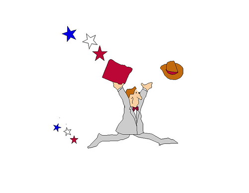
Presentation Pete - Leaping Pete

Postscript


After writing the foregoing, I delayed publication as is my custom, and found myself fiddling further. I must confess that I wrote a few more things for "the book" as if to thicken the stew further. Physician, heal thyself, or rather, Dear Reader, send me an editor, I might warrant an intervention.

Postscript to the Postscript


I fear I am afflicted. I finished another book, this one written with furious intent over the past six weeks, I feel positively Dickensian. For fear of flooding the zone while I shop the previous one, I'll serialize the latter. We'll call it Toli Tuesdays - see if you can discern the theme in the coming weeks and months.

File under: , , , , , , , , , , , , ,

Friday, March 02, 2007

Types and Faces

My friend Nate pointed out André Gide's Travels in the Congo to me a few months ago. We've been carrying on this occasional conversation about travel writing, perceptions, Africa, Conrad and the like.

travels in the Congo


In passing he mentioned that the book's typeface reminded him of Rob Giampietro's fascinating article on the Neuland question which discusses
"Neuland, a "display" typeface hand-carved in 1923 by Rudolf Koch but also Lithos, another "display" typeface digitally created in 1989 by Carol Twombly"...

How did these two typefaces come to signify Africans and African-Americans, regardless of how a designer uses them, and regardless of the purpose for which their creators originally intended them?
Let's have Nadine Gordimer as the token African.

Nadine Gordimer My Son's Story


Richard Wright can serve as the token African-American.

Uncle tom children


There's a discussion about the history of those typefaces and how they came to embody an authentic sense of, well, ethnicity shall we say. "Stereotypography" was how Nate put it. "Blackface" might be another appropriate pun. There's lots to say about such signifiers. I can certainly imagine further papers on "Issues of authenticity and its visual vocabulary: field lessons from Gutenberg's press".

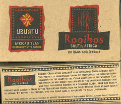
All of which reminded me of the box of Ubuntu Rooibos tea from South Africa that The Wife had picked up on her travels. It's one of those "sustainable agribusiness", fair trade, touchy-feely things marketed by an offshoot of USAID. The brand names, Ubuntu and Mpuntu, let you know what you're getting into. In case you're not convinced, the obligatory typeface is a great signifier and adds the requisite marketing frisson of authenticity: Africa. Motherland. Earth etc.

ubuntu tea


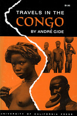
My own copy of the Travels in the Congo arrived in the mail today, and before I could turn the page and note Gide's dedication to Joseph Conrad (all travel writing owes a debt to Conrad so this was unsurprising), I was confronted by the striking cover. I realized that I'd ordered a different edition.

travels in the congo 1962 edition


Hmmm. That's more like it. Congo: breasts, nudity, enlarged ornamental lips, pygmies, natives. You don't tend to see these kinds of images on book covers any longer. They'll appear on National Geographic magazines to be sure, or coffee table books, but not on the paperback that you pull out on the bus. It appears that some cultural threshold has been crossed in the recent past, my guess is that this took place around the mid-seventies and there has been a consequent marketing realignment or adjustment.

A more subtle indicator is required and the typeface is one of the few tools product designers have, along with the product names to indicate the essence of the product they are trying to move. You need to know what you're getting but these days we don't discuss race - or at least it's always a very polite discussion. As we say in Ghana: how for do?

A theory formed in my mind that when it came time to revise Gide's work in the later 1994 edition, it was no longer culturally appropriate in the US to display nubile, big-lipped natives, even if they were all the rage back when my 1962 edition was published (that liberal Berkeley Press!). There are probably throngs of academics working on such material.

I amended the topic of the paper to "Changing mores, changing types, changing faces in representations of Africa: field lessons from Gutenberg's press". I like how academic papers seem to go with lots of sub-clauses in their paper titles.

I then remembered that Fred had discussed Then I Saw the Congo, a 1920's travel memoir by Grace Flandrau. I put in my order for that book; we all need more writing about Congo. Its cover is less exotic than Gide's. Its subtle imagery, the silhouetted rowboat of natives on the Congo river dates back to Stanley's expeditions. The mighty river Congo has great visual appeal and looms large in African iconography.

I turned around, glanced at my bookshelf and immediately noticed a couple of books that fit the visual mold. The first was In Griot Time, An American guitarist in Mali by Banning Eyre. The ubiquitous font is overlaid on his photo of Djelimady Tounkara who Teju Cole reckons as the best guitarist in the world - I won't quibble, but what about Prince?

In Griot Time


Checking Amazon, I noticed that a later edition (2002 - only 2 years on) dispenses with our typeface-du-jour and sadly also that the musician, whose face I can no longer make out, is now squashed behind the prison bar-like guitar strings tucked in the cavernous confines of a grey guitar.

In Griot Time


What should one make of the demotion of both the black-faced guitarist and our typeface? What was the designer attempting in the reworked cover? In mitigation, one notes that there is the green, yellow and red in the background to indicate the colours of the Malian flag, although one must add, the colours are washed out, perhaps to indicate the ancient status of the music, and of Mali. Authenticity is preserved, I suppose, although the ethnic signifiers have been toned down. I guess it's fair, there was no need to beat the shopper over the head as the original cover did. We could have figured things out from the subtitle.

Robert Klitgaard's Tropical Gangsters also jumped out to me.

Robert Klitgaard - Tropical Gangsters


It has the great subtitle: "One man's experience with development and decadence in deepest Africa". You don't quite need to write "darkness", "deepest Africa" gets the point across. Now of course Condi Rice and co. have no qualms dealing with the Equatorial Gangsters that Klitgaard deconstructs in his book, so I guess decadence is appropriate in the title. Kurtz's moral decay is quite apt when one reads things like the following hatchet job (Thatcher alert):
Equatorial Guinea had the bad luck to come to independence under Macias Nguema, whose rule was so terrible that a third of the population was either killed or fled. Though he had people garrotted, buried alive and beheaded (and their heads stuck on poles), the detail that sticks in my mind is his having 150 people executed to the tune of 'Those Were the Days, My Friend' played over stadium loudspeakers.
Tropical horrors continue to be our mainstay on the continent it is sad to say. Everyone owes a debt of gratitude to Conrad it seems.

Which reminds me... The best history book on Africa since independence is Paul Nugent's appropriately titled Africa Since Independence.

Africa Since Independence


If you take a look at the cover, it's as if you are out on a safari, the zebra is quietly crossing the scene in the foreground, the wide trees spread out in vistas of the savanna, you almost expect to spot a lion lazily stepping into to the picture - or an antelope perhaps. Simba. Kimba. Bambi etc. That image has almost nothing to do with the content of this brilliantly-constructed book other than to be a prime stereotype of Africa. Indeed I can't think of an image that could do more violence to the words of this sophisticated book, focused as it is on Africa's post-colonial history and the vagaries of modernity. Is that really the image of Africa since independence?

I'm fairly sure that Nugent had almost no input on his book's cover. Like almost all authors - and certainly all the ones I've pointed out in this note, let alone those South African rooibos farmers - he would have had nothing to do with the packaging of his works. Very few authors have the clout to insist on cover art, they are spent by the time the discussion over the book title is done. Still I almost disregarded his book, judging it as I did by its cover. Perhaps those purchasing history textbooks respond to different things. It goes to show that those cues can have can great influence, whether it is overt imagery or even typefaces.

I amended the paper's title: "Types and Faces: Visual Identites and cross-cultural (mis)understandings - (re)visting the Congo through fonts".

I would normally close with a playlist - and I've had requests for a Heart of Darkness playlist, but that can wait. Instead, apropos the business of not judging a book by its cover, I'll end with a Congolese proverb:
A white tooth has a bloody root.


File under: , , , , , , , , , , , , , , , , , , , ,

Wednesday, October 11, 2006

A Publication

Some good news, which I'll announce by paraphrasing Public Enemy's Black Steel In The Hour Of Chaos

I got a letter from the university the other day
I opened it up and read it
It said: "We wanna publish."
They wanted me for digital culture or whatever
Picture me giving a damn, I said "Hell yeah".

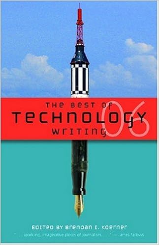
Unlike Chuck D's response to the US Government and its Army, I was elated that Cultural Sensitivity in Technology was selected to be published in Best of Technology Writing 2006 by the University of Michigan Press in its new imprint Digital Culture Books. It took a few months, as these publishing cycles go, but I now have the first ISBN associated with my name.

Best of Technology Writing 2006

There's further reason to cheer since acquisition editor, Alison Mackeen, noted that mine was the only blog post that was selected for the volume; the other contributors are mostly journalist or academic types. The web is the great leveler and I am greatful that my musings can appear along with the heavy hitters of traditional media and technology. It is rather like the way that The Humanity Critic can lie in the same folder as Malcolm Gladwell in my Bloglines subscriptions and each are equally appreciated.

Over the past year there has been interest expressed in various books of toli. It turns out that if you write as much as I sometimes do, there'll be an audience for you once you find your voice (at least on those days when the stream of consciousness tendancies are curbed). In this respect I am pleased that it is the cultural sensitivity piece that is the first to hit Gutenberg's press because it was written in a personal yet controlled voice, and I was able to navigate the tension between an entertainment and a focused monograph. The folks I like to read cross the spectrum from dry technical exposition to the satirical. One needs to cater to both education and whimsy hence my writing tends to run the gamut from small things to big ideas.

The time that was spent in editing back and forth and wrangling my conversational web style into something fit for the printed page was instructive. I am a ruthless editor of others but don't normally submit to that impulse in my own writing. Still I don't envy editors and I have renewed appreciation for the blood, sweat and tears it takes to actually make a reasonable book. In any case, I revised and expanded the article, throwing in a few bits about the human factor, the web and irreverence. Do check out the book; as befits its title, it contains lots of great writing about technology and its implications. Eminently readable and stimulating, I'll be mining it going forward and will be pointing out some of the food for thought in it.

I was asked to come up with a tagline for the article, my take:

Everything is local.

Now I have to get serious about The Pitch. Oh and I should get back to writing in this joint.

File under: , , , , ,