The COVID-19 risk guidelines in Austin, Texas present a design dilemma and a case of the blues (and more on that anon, see if you can spot what I mean). They also started with a political handicap when they were unveiled a few months ago. These are local city and county guidelines, drawn up by the Austin Public Health department, that were always likely to be ignored and run roughshod over by Texas's governor who was early in hailing The Grand Reopening of Texas, and has steadfastly proclaimed Positivity in the face of all contrary evidence.
The earlier color-coded threat level Homeland Security Advisory System in the US has also been handicapped since its inception. While some critics focus on its bureaucratic unwieldiness, what irks me most is a catastrophic user interface and design failure. The failure, as you'll note, continues into the present.
The reason is that, in order to have green be the colour for the "all-clear" threat level, the natural spectrum of light, as normally seen in rainbows, has been altered in the Homeland Security scheme. Thus ice cool blue has been promoted to "guarded" whereas tropical green has been demoted to "low".
A bureaucrat or marketing person's intelligent design is at odds with evolution, physics and reality. Blame Osama bin Laden perhaps, but any number of people in the US government signed off on this mishap. Further, we are still living in this era of Recent Non-Specific General Threats almost two decades later.
The messaging and visual branding in the covid guidelines suffers from the very same flaw with the inversion of the colors of the rainbow spectrum. You can almost hear the designer's brain ticking: let's start with a traffic light metaphor, Red-Yellow-Green. But wait, they want 5 levels, let's add in orange and blue. Oh no, what about green? Argh, I give up, let's just invert green and blue. Mixed metaphor much?
Everytime I look at these charts, I suffer cognitive dissonance, there's something not quite right. I don't have to be color blind to be confused; I get a case of the misplaced blues. Could it be so hard, I ask myself? When I bought some paint to go after Tom Sawyer, things seemed easy, I ordered my 5 cans of paint and got a nice rainbow spectrum:

When I looked at my bookshelf at my stack of Unesco General History of Africa books, I noticed that there was a similar confusion if you organized things chronologically. I suspect the editors of that wonderful series weren't visually inclined but, in mitigation, they weren't dealing with a global pandemic and coming up with an urgent public health intervention. Still, the learning exhibited in that series stands the test of time. Even if later scholars have access to more material these days, those historical tomes were a real benefit for humanity. It was certainly wise to have the red volume be Africa under Colonial Domination. The blood of colonial era lingers on the ground. Alfred Adu-Boahen's opus of historical scholarship stared with clarity at the heart of darkness and eschewed Africans as scenery in the race to Fashoda.
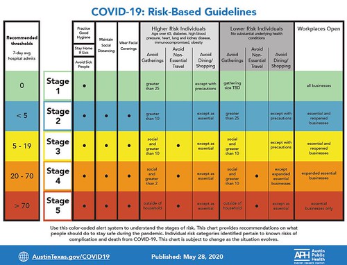
But back to our covidious guidelines and rules and regulation... Once you move beyond the blue in green, as it were, a further problem is with naming and comprehension. If you use numbers for different phases, you have to consider the order. Do increasing numbers mean an easing of restrictions or an intensification of the lockdown? Are you considering opening or closing? In Austin, it looks as if Stage 1 is the all clear whereas Stage 5 is the fullblown lockdown stage, but I could see the reverse making sense too. Leaving aside the blues, where do epidemiologists stand on endianness and indeed on numerology?
Mind you, an interesting thing to note is that the misplaced blues is not a universal design failure. The Texas Medical Association coronavirus risk assessment of activities is at least in line with the rainbow spectrum. Different designers, most likely working down the hall from each other, came up with different solutions. No wonder humanity is afflicted with version hell and the Tower and Babel.
The designers behind Harvard Global Health Institute's Global Epidemics site went with the Rule of Four instead, with the graphics for their Key Metrics for Covid Suppression. There is still the notion of the rainbow, but to avoid the case of the misplaced blues while fitting in with the traffic light metaphor, they added orange but decided that the blues could wait.
The British government in April was considering The traffic light exit strategy to free the UK from lockdown. A new economics paper suggested "a red-amber-green solution to safely ease us out of coronavirus restriction". That would be The traffic-light route to ending the economic lockdown by Gerard Lyons and Paul Ormerod (April 5 2020). It was noted at the time that this academic had sway in the past with Dominic Cummings so Mister Johnson was likely to pick up on this metaphor.
A few weeks later would read
Coronavirus: 'Traffic light' system to lift lockdown in Wales
Ending lockdown could be in phases,"like a traffic light in reverse". There would be a move from red - some "careful and controlled" relaxation - to green, which would be "much more like the lives we had before the crisis hit". The amber zone would see more restrictions lifted and, if the virus is not re-emerging, Wales could then move to the green zone.
The UK would unveil its covid alert system in June rollowing the traffic light metaphor - the blues of the worst excess mortality were seeping in
By July we were reading
Coronavirus: Quarantine scrapped for arrivals from 'low risk' countries to England, a constrained reopening was in prospect
Last weekend the government said a traffic light system would be introduced, with countries classified as green, amber or red, depending on the prevalence of coronavirus... the Join Biosecurity Centre – which was set up to coordinate the government’s response to the pandemic – will be categorizing countries with a “traffic light” system.
Each country will be rated green, amber, or red. This will depend on the prevalence of coronavirus, the trajectory of the disease, and the center’s assessment of the data’s reliability. The quarantine will only apply to those countries rated red.
The UK Government Traffic-Light Quarantine System was said to be red amber and green.
Chile launched its five step coronavirus prevention program to gradually reopen the country. They didn't bring in color to the mix, it was steps and numbers.
Seven Santiago neighbourhoods will transfer to Step 2 — they will be allowed to leave their houses freely on weekdays, with local shops allowed to reopen. The quarantine remains in place on weekends and holidays, along with a nighttime curfew every day.
La Araucanía joins fellow southern regions Los Ríos and Aysén in Step 4 of the prevention program. Here, rates of infection are
significantly lower than other parts of the country. Restaurants,
cafés, shops and cinemas can reopen with up to 25% capacity, while bars, clubs and gyms remain shut and the curfew stays in place.
If you were lucky enough to take advantage of lower interest rates caused by the downturn and attempt to refinance your mortgage, you would have faced the hard sell and the kind of mixed messages that ensue whenever traffic light meets rainbow, we always seem to get a case of the misplaced blues.
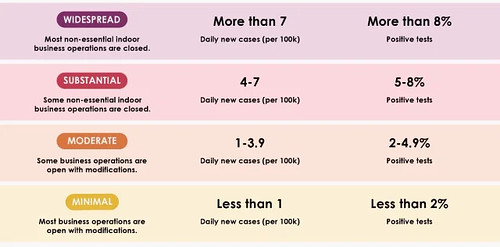
California's governor Gavin Newsom is hip to this game
The governor said that the new four tier color-coded system would match a color to each of the four tiers with purple representing the highest “widespread” risk level for a county with more than seven new cases per 100,000 residents and more than 8 percent positivity rate. Red will represent “substantial” risk, while orange represents “moderate” risk and yellow the lowest level, “minimal” risk, with those lower levels being determined by reduced numbers in case and positivity rates.
“We don’t put up green because we don’t believe that there’s a green light that says just go back to the way things were or back to the pre-pandemic mindset”
The shiny Silicon Valley solution eschews the misplaced blues using purple instead, deftly forgoes green to flee the traffic light metaphor, and embraces the rule of four in pointing to simplicity for its color-coded county guidelines
Througout this pandemic, there has been a lot of mixed signals and confusion in the messages that the public has been inundated with. This inconsistent messaging goes against the best practices of public health messaging. The public is necessarily conflicted: stay home except when you shouldn't, wear a mask although you don't need to says the governor or the sherrif. Bleach and disinfectant is first presidentially recommended, and then immediately reviled and universaly ridiculed. This is the stuff of confusion, and I won't get into the stranger turns of hydroxychloroquine, or indeed the numerous cases of drinking of hand sanitizer - that last was a bridge too far for me, to mix my metaphors.
Colors abound in the discourse, yet the only consistent message is that red is bad, the hot zone or the torrid zone of infection. Heat is also at work; hot is bad, cool is good. And if some states go with colors, some with phases, some with steps, and yet others go with levels or stages. And when it comes to numbers, some go with high numbers while others prefer low numbers as the warning. Numbers are probably better than colors but again everyting is up for debate. Is higher better or worse?
One interesting thing is that we don't hear about black much in the messaging. We don't get black or white. The implied binary choices are too stark. Life or death, Stop or go. Perhaps it is because binary choices have an immediacy that force us to reflect on mortality. Three or more states is best, there are shades of gray in this business - these shades imply some degree of human flexibility and agency. Designers reached with intent into their toolkit and came up with traffic lights, with the rule of four, and always remember, as a best practice, if five or more states are needed, we should heed the actual rainbow.
Graphic designers are having a tough time achieving clarity during this coronavirus pandemic. There's no easy living when you have mixed metaphors in a covidious time.
Mixed Metaphors
Traffic lights
Full circle rainbows
Prevention steps
Priority zones
Stage guidelines
Lockdown levels
Threat areas
Risk tiers
Confused warnings
The misplaced blues
A soundtrack for this note, here's hoping we can find the blues or some black gold of the sun somewhere over the rainbow. (spotify version)
A ball of confusion is perhaps a good description for the novel coronavirus
See also: Colors, a playlist (spotify version)
This note is part of a series: In a covidious time.
File under: visualization, metaphor, marketing, design, confusion, policy, comprehension, color, abstraction, technology, usability, culture, observation, perception, coronavirus, pandemic, public health, human factors, covidious, toli